I’ve been wanting a treadmill desk since 2005, when I first read about James Levine putting one together.
(Reference one of my comics from 2005’s Christmas newsletter:)
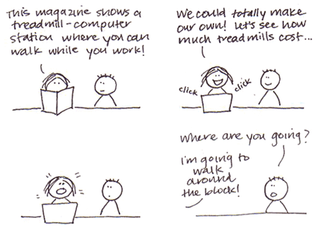
Steve and I are not quite as penurious as we used to be in 2005, and it was reading this blog post by Ann Marie Michaels where she credited much of her increased activity to her treadmill desk that I decided to bite the bullet. I also pinned a number of DIY treadmill desks to a new Pinterest board.
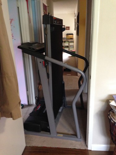
That very weekend, I went on Craigslist, and lo and behold, there was a $180 treadmill for sale literally around the corner from our home. And we even had our friends’ truck in the driveway after a car-trade-for-a-day sort of thing. Perfect! In a matter of hours, we were owners of a Pro-Form 725 FP. It seemed massive.

We had a random piece of white melamine shelving in the garage. I had Steve hold it against the treadmill. Pushed up against the top edge of the angled handlebars, it was a good height for a keyboard. I took some scrap 2×4 and drew a rough angle for a cut. With two screws on each side, I now had my Treadmill Desk Beta.

The screws weren’t countersunk so they stuck up a little bit, but they were far enough out that it didn’t bother me.

To attach the supports, I used Velcro dots and strips that we already had on hand.


Here’s how it looked in our bedroom:

But where I really wanted it was in the office! Naturally, I picked a time when Steve was not at home to help me. I managed to scrape the floor nicely as I shoved the treadmill down the hallway. Then I wrestled the treadmill across the short span of carpet. And then I was stuck.
After removing the office door and making use of the doorways and closet opening, I was able to finally swivel and pivot the treadmill into the office. (At one point, it was standing up on one corner, wedged against the walls, and I had to crawl under and around it to get to better angles!)

Then I moved it into the place where my filing cabinet, with printer on top, used to be. The file cabinet was now in the middle of the room (you can see it in the picture below). The printer got moved to our new upright file cabinet in the other corner of the room. Luckily, it’s a wireless printer, so location wasn’t important.

I took it on a test run, moving my work-issued laptop and setting the keyboard into the built-in book holder. I configured my Bluetooth mouse and keyboard and successfully walked and worked for the first time! I did this for a couple of days — using my Mac at my desk for most of my work, and moving to the treadmill when I had to do stuff on the PC.
Things got serious when my Amazon order arrived. I purchased two articulating wall mounts ($22.99 each) and a second monitor (20-inch, $99.99). My other monitor is 22 inches, and I approximated that I would have about that much room to work with if I put them up side-by-side.
The wall mounts arrived – a box inside a box inside a larger box. Really, Amazon?

I had to install a new surge protector onto the bottom of my declutered desk’s pegboard so that cords would properly reach.

Then, I put up the first wall mount and mounted the new monitor.

Connected to my work laptop:

And it swings to the side…

… leaving room for the second wall mount. I needed Steve’s help to strong-arm the bolts all the way into the wall for this one!

Second monitor mounted and connected! Although I was rather annoyed that the insert-and-click post of the monitor stand is not designed to be removed, short of taking a hacksaw to it. Thank you, Samsung.

For now, I put my Mac on the top shelf of my Ikea Jerker desk (another Craigslist find from a while ago) so that the monitor cord would reach.

That was all well and good, but I’m guessing it’s not great for a laptop to be continuously jostled by the movement of someone walking on a treadmill. So, using some half-inch plywood that we already had on hand, and using some shelf brackets we already had as well, I made a shelf.

The shelf has a little slot cut out in the back so that cords can go through… and you can see the Very Basic Shelf Brackets that I’m using.

I covered the shelf with a few coats of polyurethane, leaving it the natural color of the plywood (with a slight “ambering” effect).

The shelf was also positioned with about a half-inch of clearance to the very top point of the treadmill, to provide as much room as possible for my Mac laptop screen to open underneath.

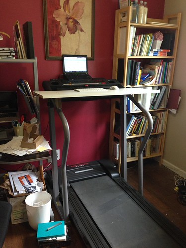
Because this is what I wanted: Mac laptop open on the shelf with external monitor above, and PC external monitor above.

After working on this setup for a week or so, I was ready to make the final version of a treadmill desk. I was envisioning something with natural-looking wood, matching the shelf, but with friendly curves instead of hard corners. I had some quarter-inch plywood in the garage, just enough, in fact, for my new desk, so I cut it to shape with a jigsaw and countersunk the screws.

I made the bottom supports longer – and spent a lot of time with Steve patiently holding the board with a level on top of it so that I could get the angle just right.

I filled up the screw holes with wood filler and put on a coat of polyurethane but then realized the wood filler didn’t pick up the “ambering” effect AT ALL. They stood out visually like sore thumbs. (No picture.) So I ended up sanding the whole thing off and using Minwax Ebony stain (had it on hand in the garage from the treasure chest we made a long time ago). I applied the stain twice, letting it soak in for 15 minutes the first time and 2 hours the second time (I forgot about it!). Then I applied two coats of polyurethane to the top and one to the bottom (getting impatient!).
And here it is!

The dark brown actually blends nicely with our dark wood floors.
Here’s a picture of the supporting pieces underneath. I wasn’t initially going to stain underneath until I realized that you could see the side supports, and now I’m glad I did the whole thing.

Because of the longer supports, I added on a few more Velcro dots.

Contrast with what I had before:

The desk feels much more secure now – before if I leaned on the front part of it, it would start to tip off.
Everything is the same as before – Two mounted monitors, Mac open, PC closed, and box of Kleenex at the ready. I put my water glass and coffee on the top shelf of the desk so it’s easy to reach.

I use a Mac wireless keyboard. I miss my extended keyboard that I used at my desk (but it’s wired), so I may eventually get a full wireless keyboard. Oh why doesn’t Apple make a full wireless keyboard…? I love the feel of the wireless one – it’s so narrow and polished. Then, I use my Logitech Bluetooth mouse. I got this a while ago, although I have a functioning Wacom Intuos 2 Tablet/Stylus/Mouse, because when I started using Synergy to share my keyboard and mouse between my Mac and PC, the Wacom didn’t work with Synergy. Now that I’m doing all my work on the treadmill desk, and facing the reality that I haven’t used my Wacom hardly at all except for some minor drawing in Illustrator and to sign my name on PDFs, I’m cutting the ties and getting rid of it.

(The Field Notes notebook and fancy Pen Type-A have nothing to do with my treadmill desk system but are there for show.)
So yes – with one wireless keyboard and one wireless mouse, I’m able to use my PC and Mac simultaneously. AND walk on the treadmill! (There are times when the work I do requires me to connect to another network on the PC, and the high security measures on the government site kicks off Synergy. In that case, I pull my PC laptop down to the treadmill desk and use the built-in keyboard and trackpad to work. But it’s still nice having the external monitor so I don’t get a kink in my neck!)

One side note is that I moved my Mac Dock from the bottom to the left side. Because I had my external monitor arranged above my laptop, the dock ended up on the smaller screen at the very bottom. SUPER annoying. So now I’m getting used to having the dock on the left side of the big monitor.
Here’s a picture of the new surge protector installed on the side of my desk closest to the treadmill:

And unfortunately my work area isn’t as decluttered as it used to be, with wires visibly showing:

But that is a small price to pay for being able to walk while I work! (And speaking of prices – this was a relatively low-cost venture after the cost of the treadmill and new monitor, mainly because I had scrap wood and power tools already!)

And just how is the walking-while-I-work thing going, you ask?
Well – let’s look at my Fitbit data:

I find it VERY hard to make it the full 10,000 steps on the days I don’t work!
My speed is usually set to 1.8 mph (I started at 1.5 mph and worked my way up). It’s a moderate pace. I’m well able to type and use my mouse while I walk, but the treadmill is noisy enough that I have to turn it off for meetings. So on the days that I have a lot of phone calls, I walk a little less. I can usually get 5-7 miles a day.
With small kids in the house, I find that I get enough breaks from walking and have a hard-stop with work hours as it is so I haven’t missed sitting down too much. But I could definitely see having to figure out a sitting solution if I worked longer hours. I can’t imagine a bar stool on a treadmill, even stationery, would be a good idea!
That’s that for my treadmill desk!
Now I just have to clean up the rest of the office. Especially my desk.


 Corrie Haffly